Design System
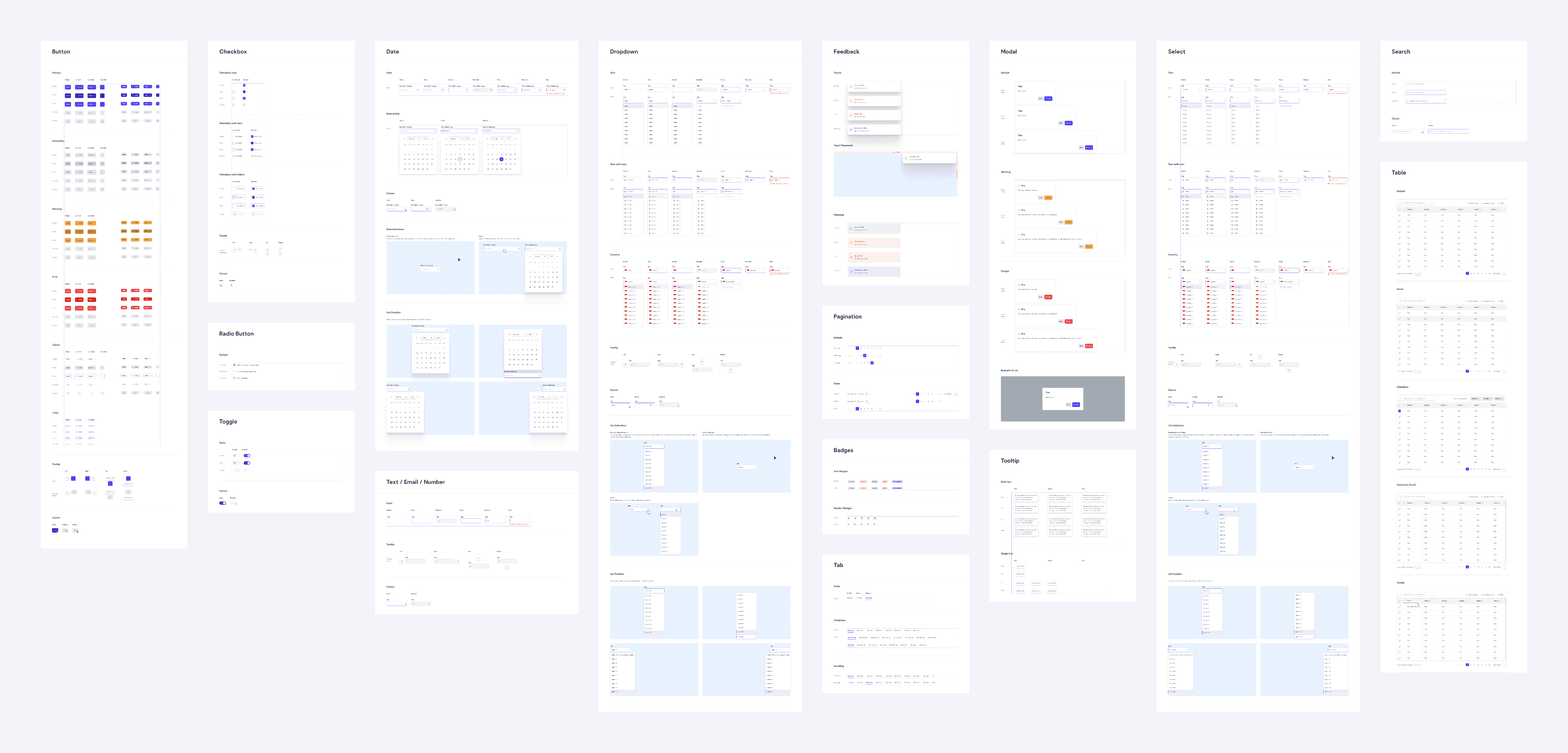
Crafted a collection of reusable components and design standards created for Accredify’s products. Created to achieve scalability and visual consistency.
Company
Accredify
Project duration
3 months (2021)
Team members
1 UI / UX Designer (me)
2 Frontend Developers
The challenge
As the company’s offerings expanded and the design team grew, maintaining visual consistency became progressively challenging.
With different designers and developers handling different aspects of the products, the same components were re-designed over and over again, resulting in inconsistencies and unnecessary duplication of work.
Why we needed a design system
Achieve a unified design language across all products, channels and cross-functional teams.
Designers and developers can quickly replicate components and allocate efforts towards complex problems.
Design fixes and improvements can be instantly propagated to all products.
UI practices are readily available and newcomers can get up to speed faster.
Scoping the work
Building a design system from scratch, the first thing I needed to do was to secure buy-in and get feedback from the relevant departments.
Considering the limited resources we have as a small startup, we decided to implement a MVP design system that was easier to create, maintain and access. The plan was to start with a simple system, evaluate its effectiveness and incorporate improvements as we move forward.
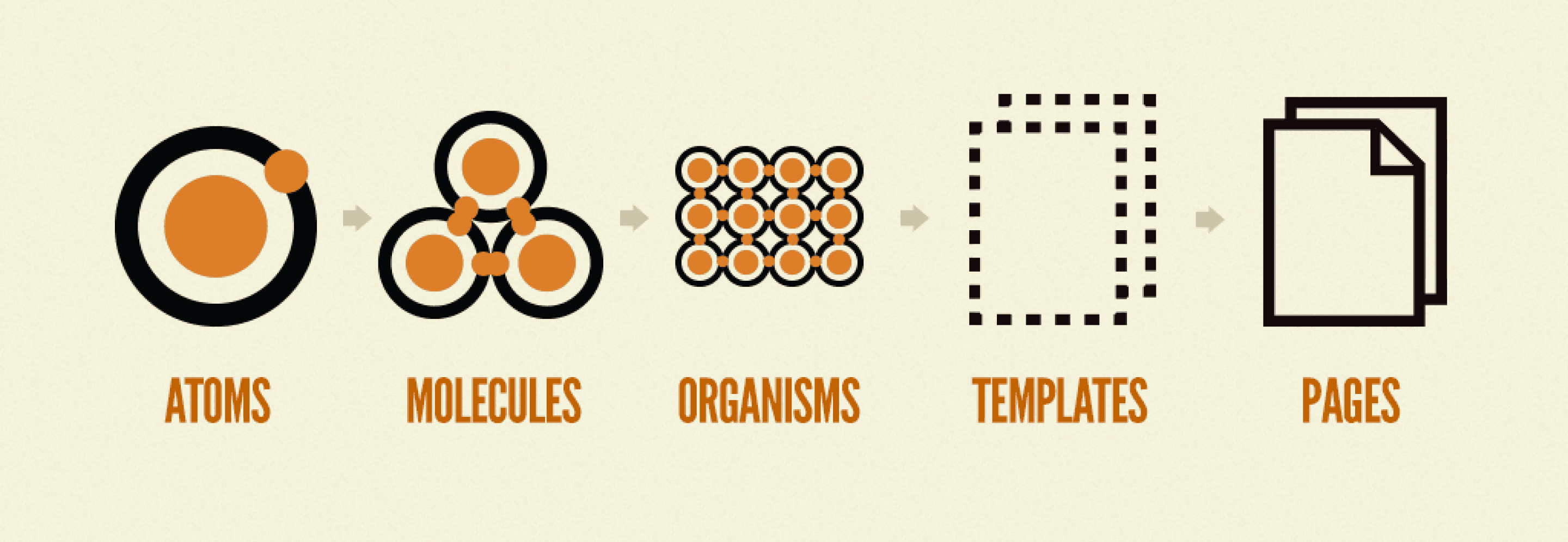
A visual I referenced from Atomic Design by Brad Frost to explain design systems to the different teams.
Research on design systems
To get myself up to speed, I read up on design systems, learning how other designers created design systems, the challenges faced and recommended best practices.
I explored design systems crafted by design-centric companies, including Intuit Mailchimp, Zendesk, Shopify and Atlassian. Since we were keeping our first roll-out simple, I weighed our options between what was required in our MVP, and elements we should consider in the future.
Conducting an audit
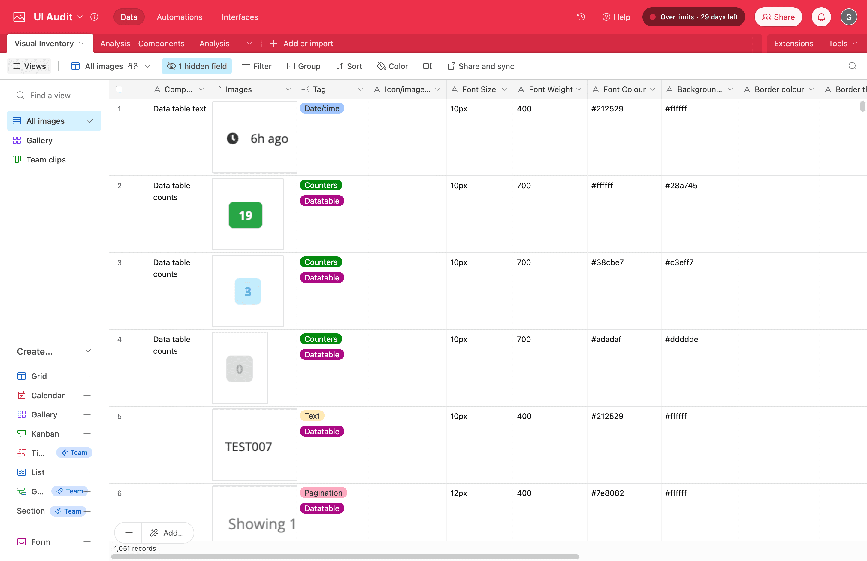
Next, I examined the visual elements and user experience of the existing products and curated a library of screenshots and findings.
Through this audit, I discovered a few recurring themes that we needed to improve on following the introduction of the design system. These findings were also shared with the team to underscore the importance of having a design system in place:
Usage of many different colours in random shades and tints
Lack of colour contrast
Over 3 different fonts with varying weights and improper sizes
Inconsistent usage of icons and illustrations
Different permutations of the same components
Lack of visual hierarchy
Crafting the design system
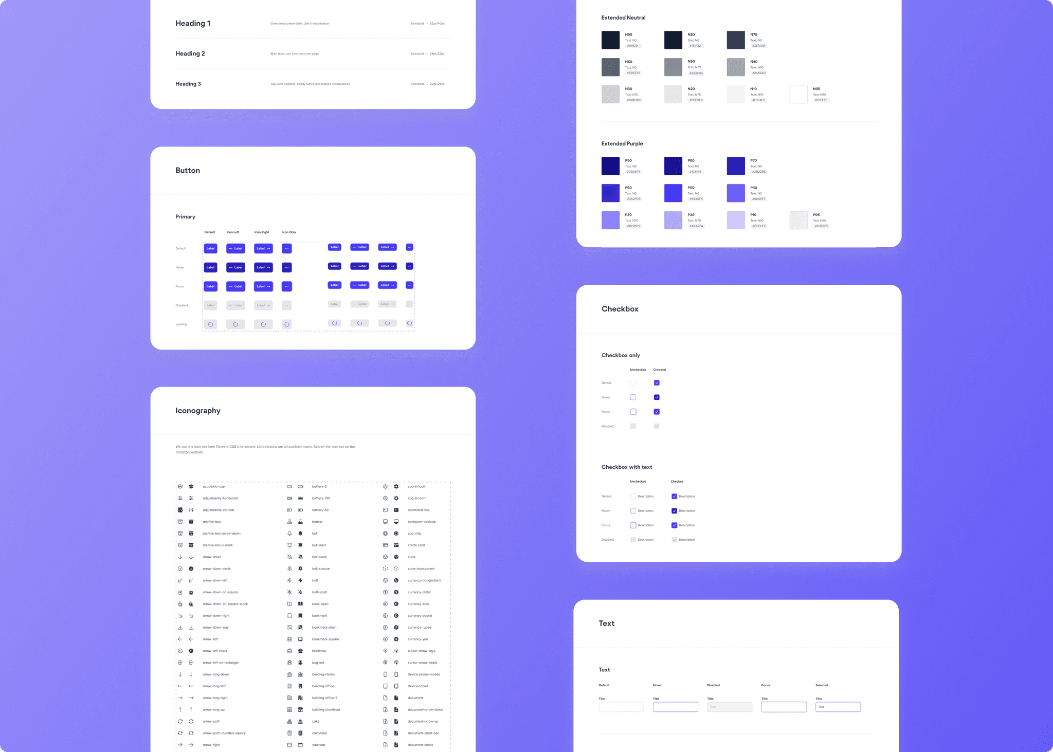
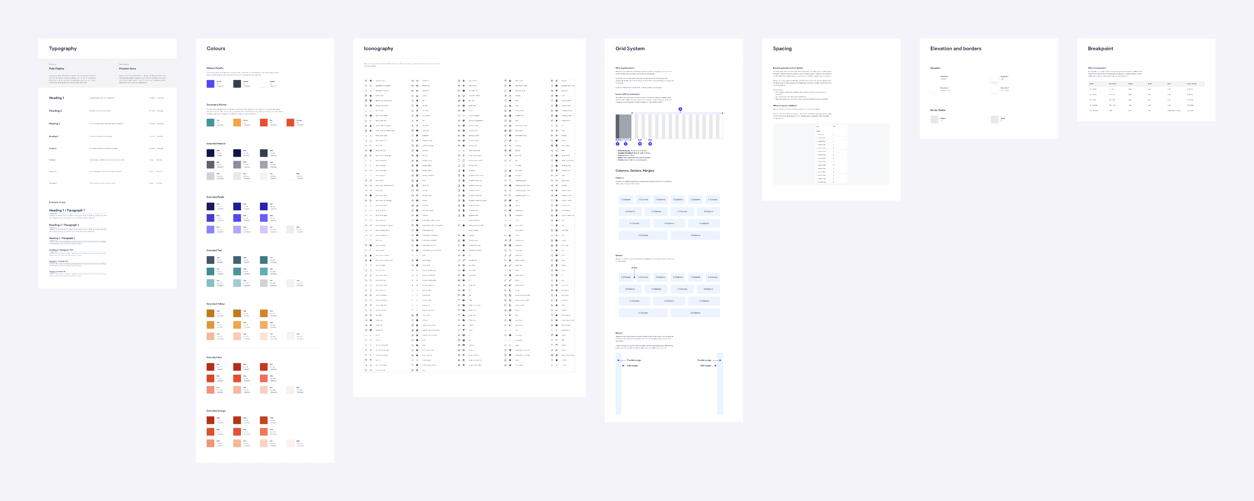
After prioritising the contents in the MVP design system, we decided to include a style guide that details the visual elements of the system, and a components library consisting of the most frequently used components in our existing products.
Style Guide
Colours
Typography
Iconography
Elevation
Spacing
Breakpoints
Grid system
Component Library
Button
Feedback
Checkbox
Date picker
Dropdown
Modal
Pagination
Radio button
Search
Select
Table
Tab
Text
Toasts
Toggle
Tooltip
Colour palettes and contrast
To introduce consistent usage of colours, the design system comprises of 6 colour palettes, including usage guidelines and WCAG AA contrast checks to be above 4.5:1.
Standardised fonts and sizing
To achieve better visual hierarchy, the design system comprises of 2 fonts, 6 headings and 2 paragraph styles where all line heights are aligned with the 4px grid.
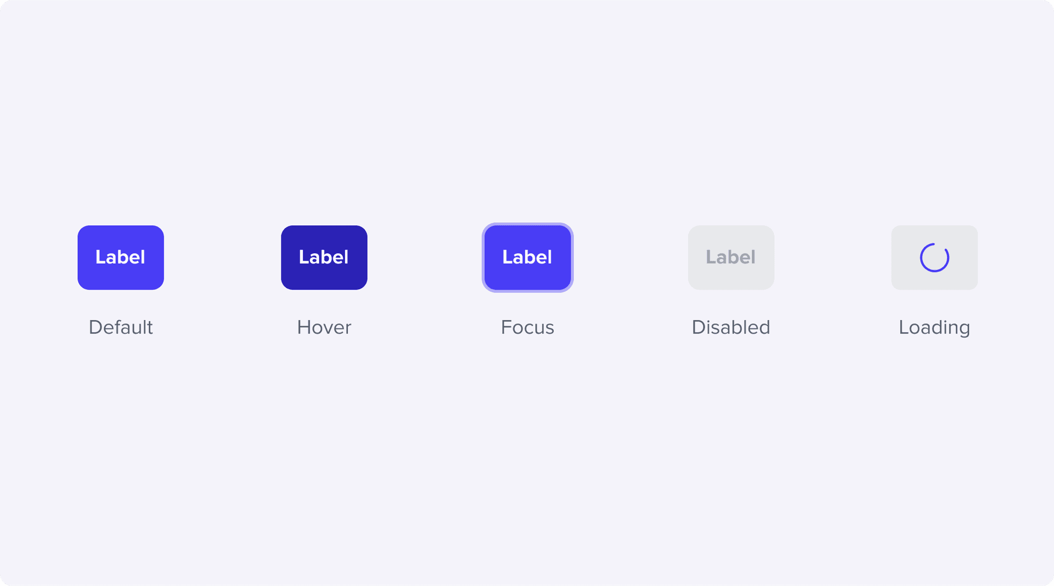
Interaction states
Each component incorporates visual styles that communicate the status of the component during user interaction.
Guidelines
To guide designers and developers, the element details an explanation of the element and how it is typically used.
Outcomes and next steps
Efficiency and velocity
Even though development of the initial components required a considerable amount of engineering effort, it has noticeably increased our productivity and velocity. Designers and developers were no longer spending extra effort re-creating components, and miscommunications over the functionality and appearance of elements were reduced.
With our ongoing efforts to improve productivity, we are targeting to include more variations of existing components, and frequently used elements such as illustrations, cards and timelines.
Consistency
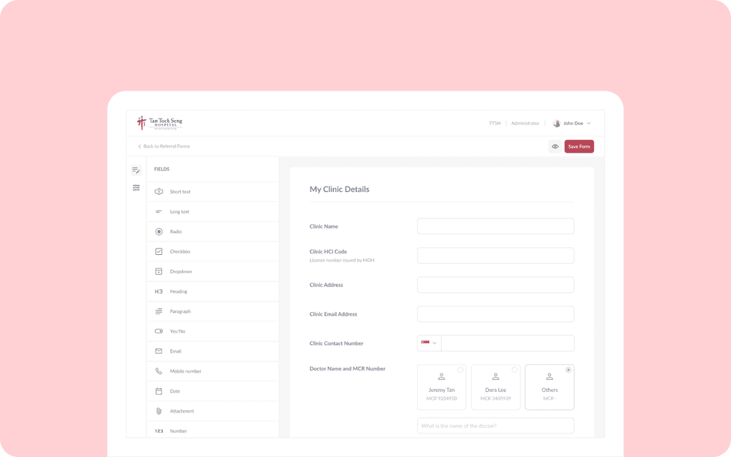
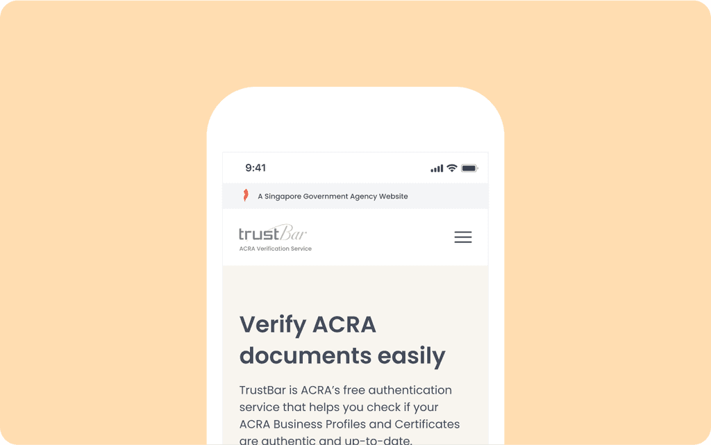
As the design system is first rolled-out to newer products, we noticed significant improvement in visual consistency as compared to the older platforms. Newer products built on the design system have better visual hierarchy, colour contrast and components look and behaved in a consistent fashion.
Documentation
Although the documentation was a step up from before, there is still room for improvement where we can provide examples of do’s and dont’s, best practices and copy writing guidelines.
We will also be working closely with the engineering team to nail down how we can deliver documentation in a way that is useful for developers, accessible by everyone, and easy to maintain.
Other works
Let’s Connect
It doesn’t just end here — Feel free to reach out for any opportunities or even just to bounce around ideas. 😊
Let’s connect
