Document Verifier
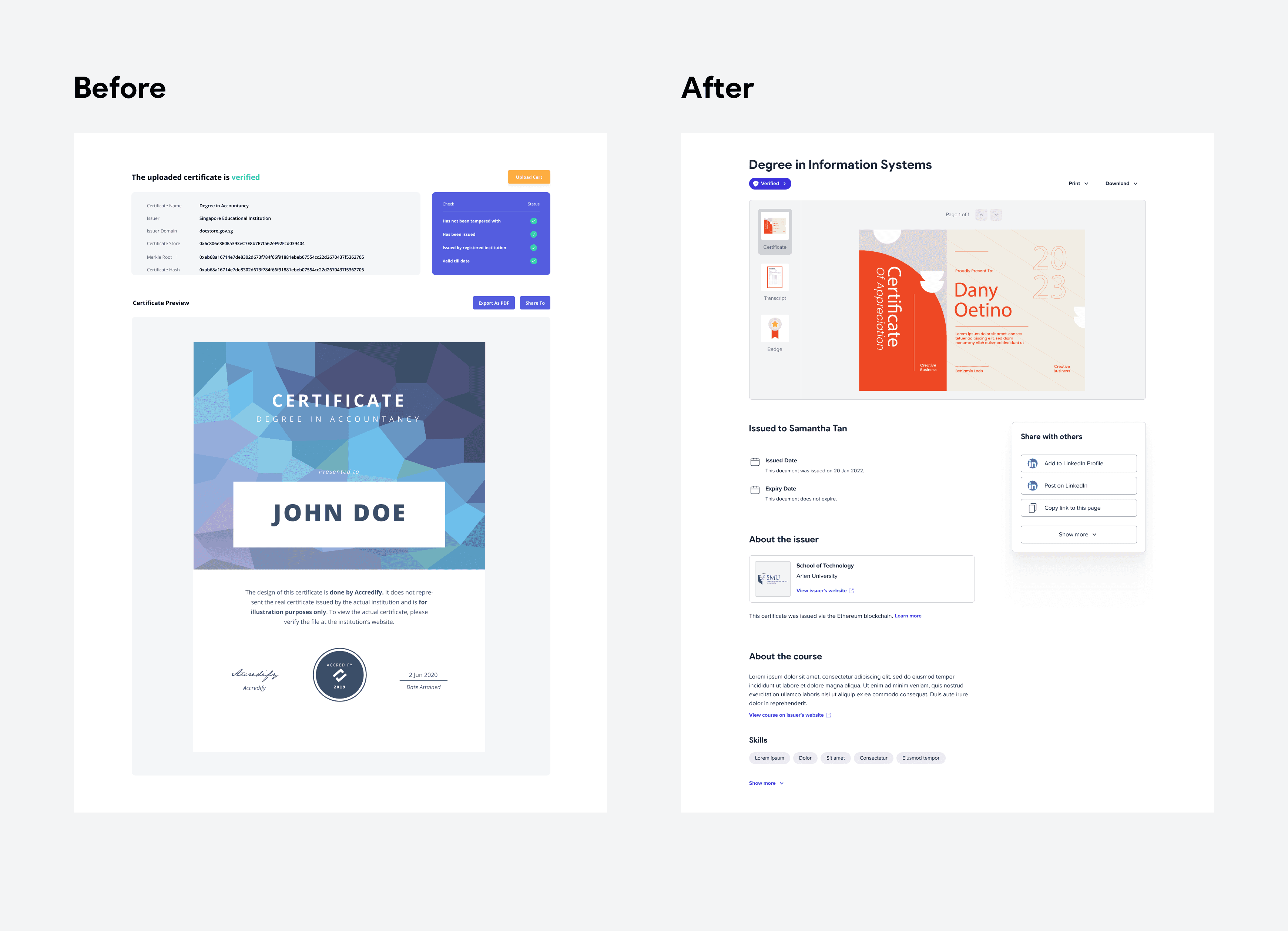
A platform that enhances the reliability of educational certifications in Singapore by allowing users to view and check the authenticity of verifiable certificates.
Company
Accredify
Duration
2 weeks
My role
User research
Wireframing
Prototyping
Usability testing
Enhancing the reliability of educational certifications
Context
Accredify provides educational institutions a way to create, issue and manage digital documents that are verifiable. Students who receive their verifiable certificates can share it with employers to view and check its authenticity.
Challenge
At the start of the project, we spoke to the Account Managers and Customer Support team to understand the feedback our clients had for our initial design:
Users had a hard time understanding the jargons used
Difficult to customise what they wanted to share with others
Research goals
With the initial feedback received, we dived further into the problem space to:
Understand the student’s motivations on the platform
Identify frustrations encountered when viewing and sharing documents
Identify opportunities that would aid students in their job search
Analyse features offered by our competitors
Interviewing users
We interviewed 5 fresh graduates from different institutions to learn about:
How do fresh graduates prepare for job applications?
What do they wish to achieve on the platform?
What are the important information they wish to see on the platform?
What information do users want to share with potential employers?
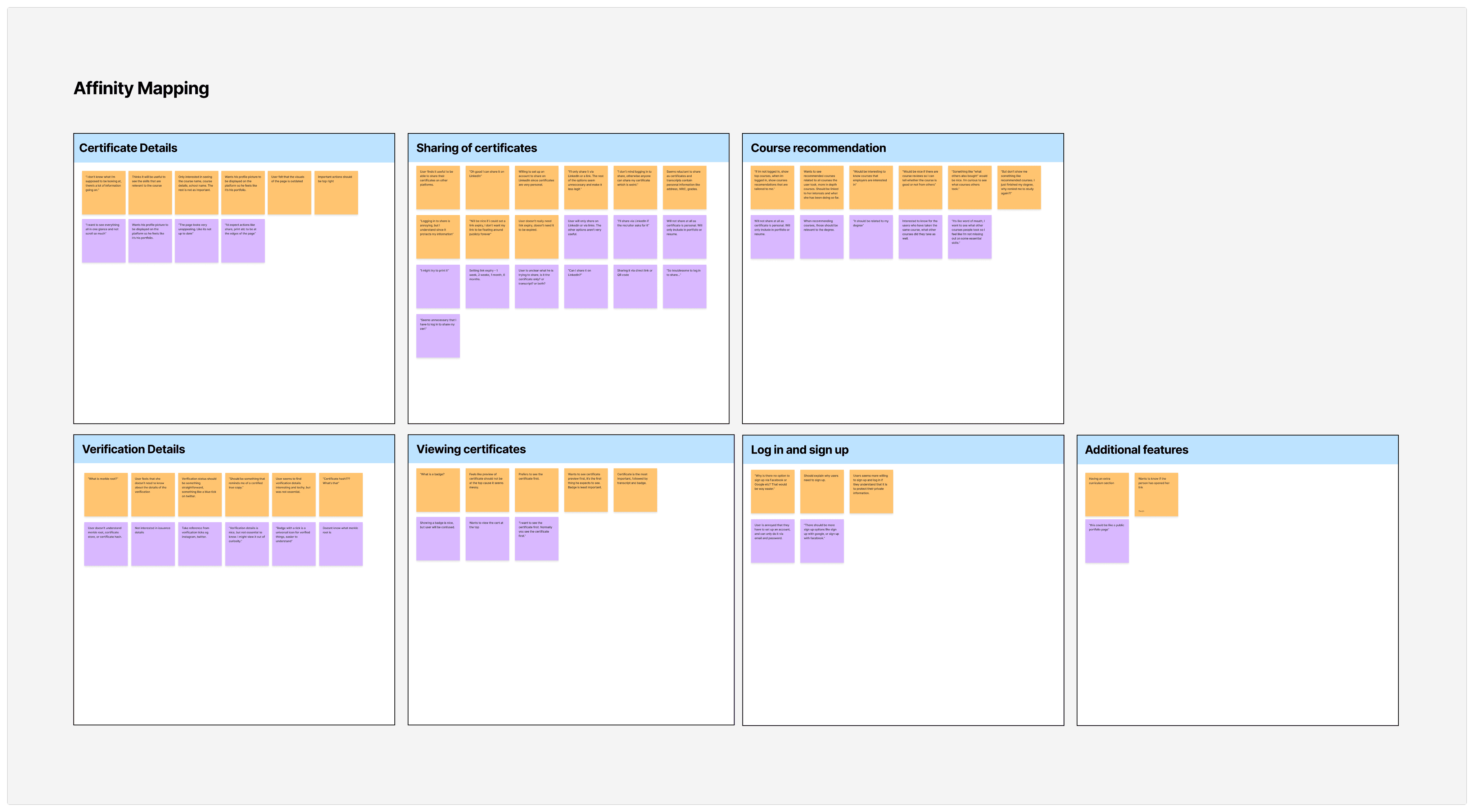
Insights from the interviews
LinkedIn is the go-to platform for applications
To keep their LinkedIn profiles updated, users expect to share their certificates to the platform easily.
Flexibility in choosing what to share
Certificates contain private information. Users need a simple way to choose what they share with employers.
Verification details should be clear and concise
There are too many verification information and it should be simpler and more straightforward.
Interest in upskilling to remain competitive
Users would find more value in the platform if it offers suggestions on potential courses they could take next.
Framing the challenge
Following the user interviews, we spoke to our product and engineering team to share our findings with them. After estimating the resources available and confirming product directions, we decided to deprioritise course recommendations in this session and explore this feature in a future phase.
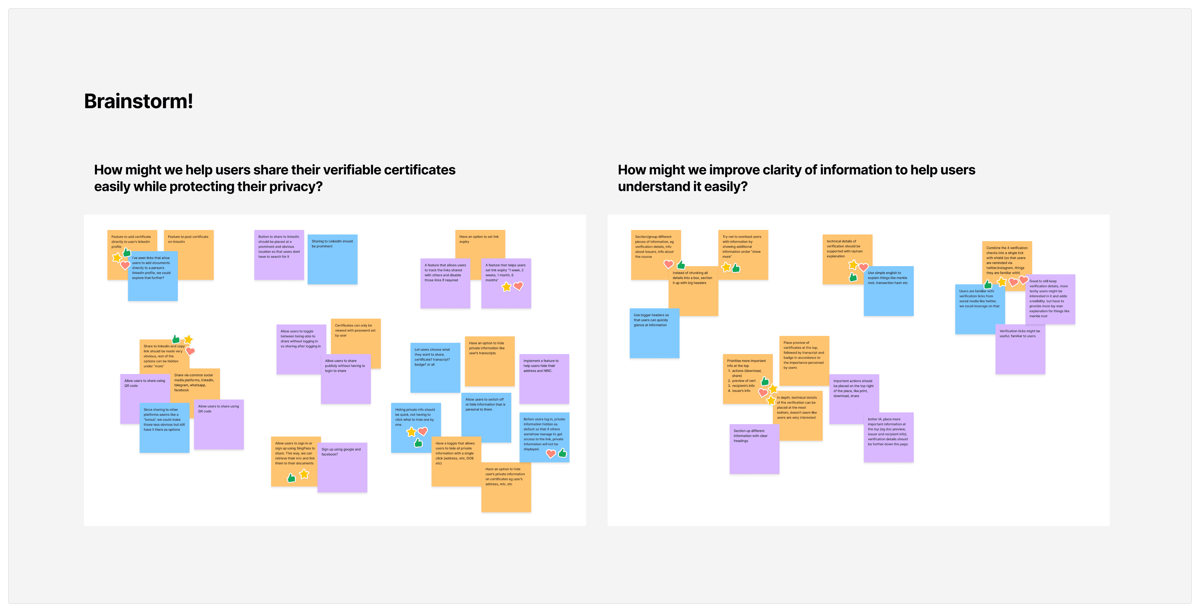
We crafted 2 HMW statements that would guide our brainstorming session:
How might we…
Help users share their verifiable certificates easily while protecting their privacy?
Improve the clarity of information to help users understand it easily?
Brainstorming & Dot Voting
Participants were given 10 minutes to produce as many ideas as they could. They were reminded to keep an open mind as there are no bad ideas, to be positive and to aim for quantity instead of quality.
After the first brainstorming session, participants were given time to explain what they’ve written and look through ideas provided by others. Another 5 minutes was allocated to allow participants to build on the ideas from others.
At the end of the session, each participant were given a number of votes to assign to their preferred ideas. Voting was done privately to avoid persuaded voting and group voting.
Creating wire flows & validating solution
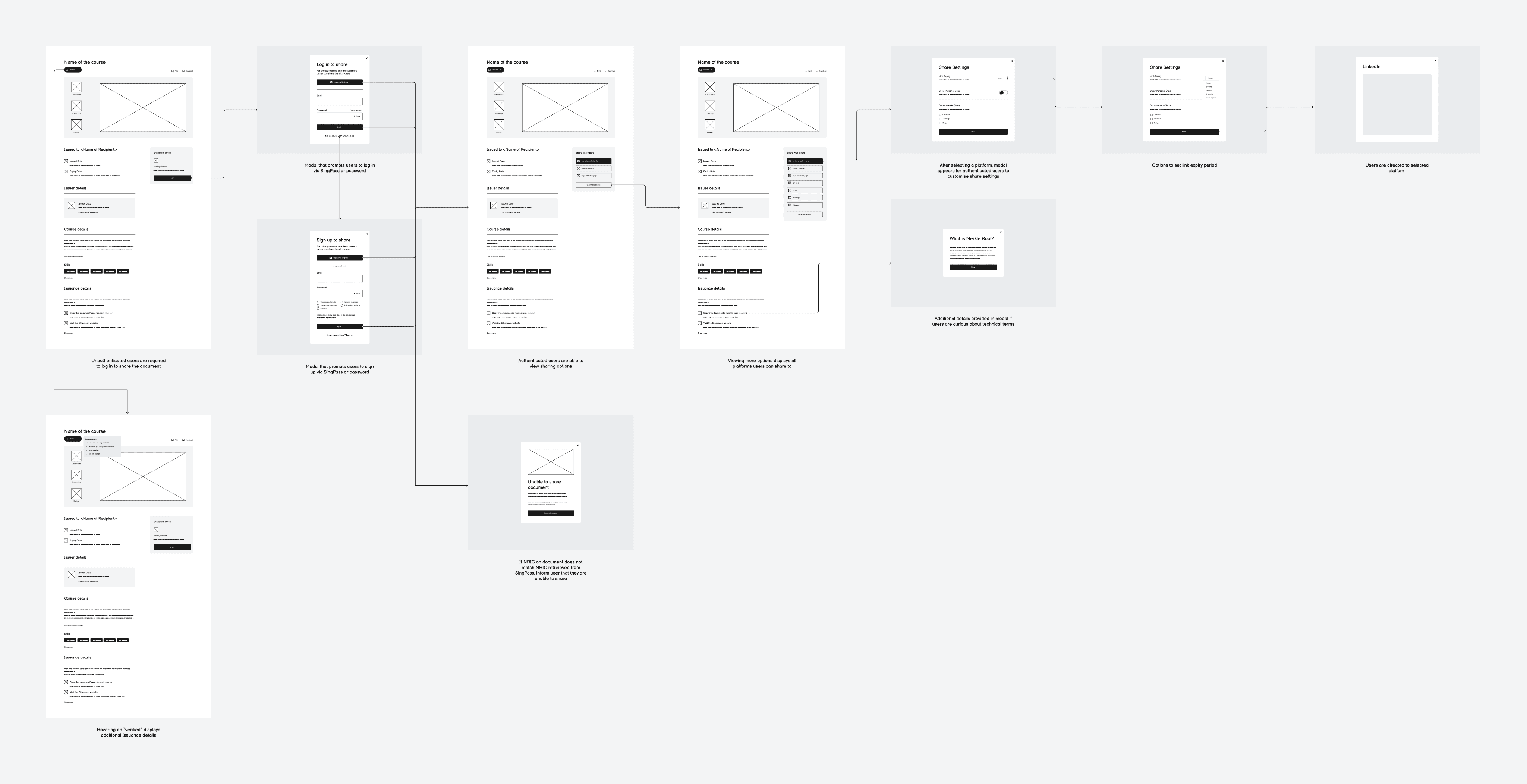
Once we had a better understanding of the problem and ideas on how to solve them, we rolled up our sleeves and quickly mocked up a few wireframes to visualise and validate the solution.
With the wireframes on hand, we first consulted a few developers to ensure that the solution was technically feasible. Afterwards, we conducted 5 usability testing sessions to validate whether the new designs would solve the users’ problems.
As the facilitator for the session, I prepared some scenarios and tasks for the users to perform and observed how the users interacted with the wire frames. From the sessions, we observed:
Insights from the usability testing sessions
Improved information structure
The new presentation and categorisation of details helped users to find and understand information easily.
Information is more concise
Users could quickly spot key information they required without being drowned out by extra details.
Customising information to share is straightforward
Users could navigate through the share settings smoothly without any help and expressed that the process is intuitive.
Adding to LinkedIn profile is the most common action
We noticed that all users wanted to add the certificates to their LinkedIn profiles instead of posting it.
Negative sentiments towards “Sharing disabled”
Most users felt frustrated when they noticed sharing is disabled and wanted to know the reason behind it.
The term “Issuance details” is confusing
Users expected to see information about the issuing institution rather than verification details.
Crafting high fidelity designs
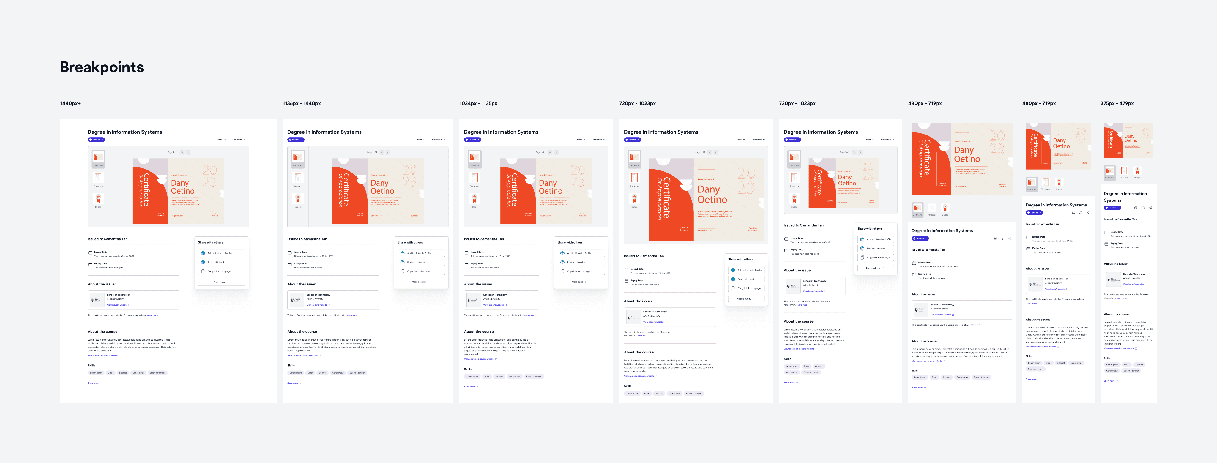
Using the insights gathered from the usability testing sessions, we crafted the high fidelity mockups with handover notes for developers, including designs for various breakpoints to ensure web responsiveness.
Additionally, we incorporated our new style guides and design system into our designs to ensure visual consistency across all our product offerings.
Outcomes and learnings
Although we would love to see our designs come to live, a change in direction required the teams to prioritise other projects instead.
That being said, once the design is live, I’d iterate the process and:
Conduct a second round of user testing to identify active usability issues
Explore the possibility of providing course recommendations for our users
Identify other opportunities to improve on the product for our users

